To help an online tutoring start-up level-up their student and tutor experiences, I redesigned their online learning platform.
Redesigning an online learning platform on a tight timeline.
Senior Product Designer
The problem: a bad first impression
I joined Varsity Tutors as the very first design practitioner on staff. The company had existed as a boot-strap startup for 7 years and had utilized various engineers and digital agencies to make design decisions. There was no coherent design system, style guide, or brand expression.
We knew we needed a unified design system to bring cohesion to our family of products but we didn't have the luxury to go heads-down and craft one. Our approach was to work incrementally by developing the design system simultaneously while updating the design of our products. The first product we selected was our online learning platform (AKA classroom).
Personal Contribution and Deliverables
Project Lead
Research: competitive and analogous research, stakeholder survey, recruiting, planning, and facilitating user testing
Design: mood boards, iterative sketches, low fidelity wireframes, full fidelity comps, style guide, design specifications
Implementation: collaborated with engineering team for their first time working with a designer providing design specifications
Employer
Varsity Tutors (NYSE: Nrdy)
Project Length
3 Weeks
My Role
Project Lead, Product Designer/Researcher
The Team
Product Designer (myself), Product Manager, Software Engineers
A brisk 3 week plan
Week 1
Survey senior leadership and executive team to determine our brand strategy
Synthesize findings into themes – our Brand Tenants
Use brand tenants to guide mood boards and typographic explorations
Week 2
Use design and type exploration to inform a variety of designs
Present designs to senior leadership for evaluation
Iterate design based on leadership feedback
Week 3
Create comps for every interaction and screen in the product
Create style guide/design specifications
Work with the product manager and engineering team to implement
Brand tenets
1. INDIVIDUALIZED
Serving customers' unique needs on their terms - when, where, and how they want it.
Design Translation
Effortlessly legible across screen sizes, optimized for touch (or any input), appropriate color contrast, lack of clutter enables cognitive speed.
2. EXPERT
Our tutors, our service and our tools inspire confidence.
Design Translation
Should feel thoughtful and consumer-centric. The UI is "orderly and thoughtful" - paying close attention to details like well-aligned grids, proper type hierarchy, and consistent spacing.
3. TRUSTWORTHY
Honesty and transparency builds trust, and our customers trust that we’ll meet their expectations.
Design Translation
Consistent design everywhere helps people to know what to expect. We never “hide” anything from customers (i.e. through small type, dark patterns, etc.)
4. HUMAN
We take education seriously, but we also believe that learning is fun. Our tone is informal, warm, and upbeat.
Design translation
Colors are warm and welcoming, messaging is personal and the tone feels human and trustworthy - while also not being overly casual.
Mood Boards
Round 1: Mood boards. Left = expert, clear, authentic. Right = Warm, bespoke, fun
Round 2: Concepts
Design options presented for executive review
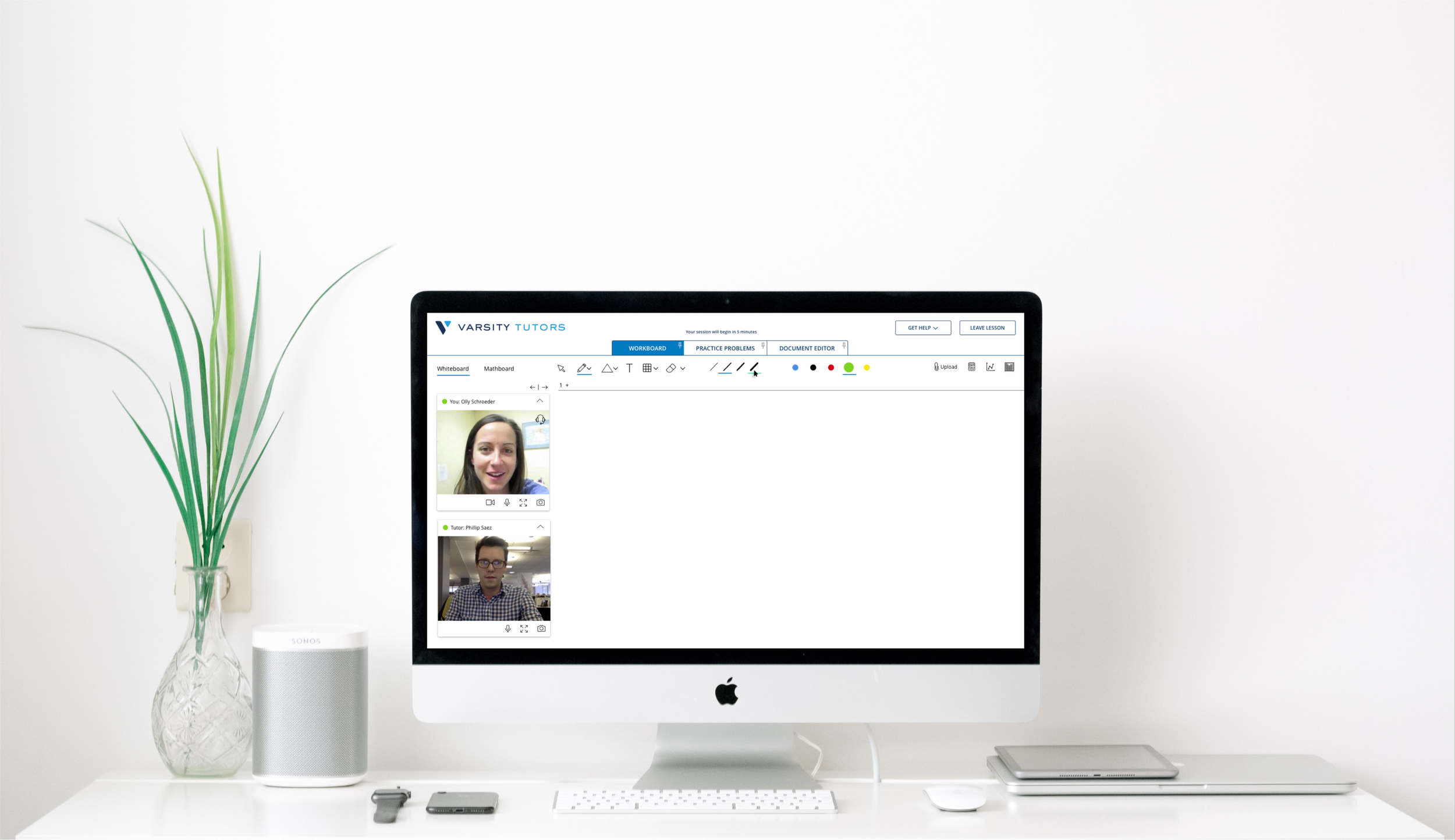
Before & After
Our plan was to begin by creating just enough of a design system to support a UI refresh of our online learning platform.
The Outcome
This new design was live in production 2 weeks later. The UI was well received in a follow up usability study with six tutors. They were asked “On a scale of 1 to 5, how modern would you say the online platform looks?”
The new UI got an overall rating of 4.6 stars!