Helping a bootstrap start-up to scale-up
To prepare an educational technology startup to scale, I redesigned the customer responsive web app in 6 weeks
Senior product designer
The problem: a disjointed customer experience
I joined Varsity Tutors (NYSE: NRDY) as the very first design practitioner on staff. The company had existed as a boot-strap startup for 7 years and had utilized various engineers and digital agencies to make design decisions. There was no coherent design system, style guide, or brand expression. Our vast variety of digital products (marketing site, client site, tutor site, learning tools, mobile apps, etc.) each had their own radically unique look-and-feel and interaction patterns which created a disjointed experience and a bad first impression.
We knew we needed a unified design system to bring cohesion to our family of products but we didn't have the luxury to go heads-down and craft one. Our approach was to work incrementally by developing the design system simultaneously while updating the UI and UX of our products. We created our design system while redesigning our client web app.
Personal Contribution
User research: competitive and analogous research, heuristic review, analytics, recruit, plan, and facilitate usability testing
Synthesis: insights, opportunities, design implications & strategy
Design of responsive web-based software: content blocking, sketches, low-fidelity wireframes, full-fidelity designs, interactive prototype
Development: collaborated closely with the engineering team, facilitated bug bash
Deliverables: Information architecture diagrams, content blocking diagrams, low & high fidelity wireframes, low & high fidelity prototypes, design system
A 6 week design plan
To meet our deadline, I put together a 6-week design plan that enabled our engineering team to get started on week 2.
Week 1
Research: analytics, heuristic review, competitive and analogous research
Preparations: Create design system framework, research best practices
Design: Content blocking, IA Diagrams
Weeks 2-3
Create a screener and recruit participants for user testing
Evolve design to low fidelity wireframes for 75% of screens
Evolve design to high fidelity design for 25% of screens
Building out design system framework
Begin design system explorations
Week 4
Create interactive prototype
Create a user test guide
Facilitate user testing
Synthesize findings
Iterate designs based on feedback
Weeks 5-6
Evolve design to high fidelity design for the remaining 75% of screens
Create a process for development hand-off
Kicking-off design with just 1 week lead time
The engineers were ready to get started right away. In talking with them, I learned that if I could hand-off a sitemap and content blocking diagrams, that would be enough to get them unblocked. I created 3 different site maps and conducted rapid tree testing to narrow in on one approach.
A sitemap I created to define each release
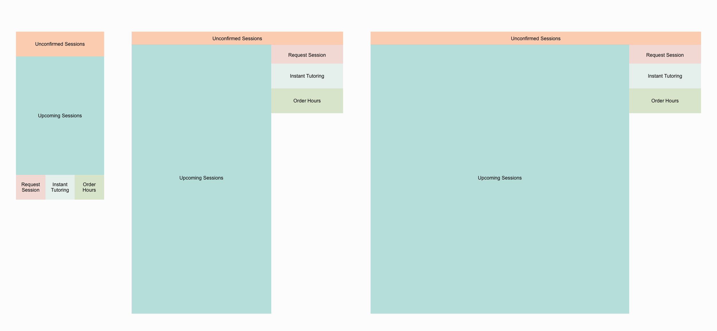
Content blocking diagram example from scheduling screens. These diagrams enabled our engineers to get started on week 2 of this design project.
From a sitemap to wireframes
To transition from our very high level artifacts to low fidelity wireframes, I searched for inspiration that embodies our brand tenets: Individualized, Trustworthy, Expert, Human, Remarkably Easy. It occurred to me that Duplo Blocks are the perfect example of a product that embodies our brand tenets.
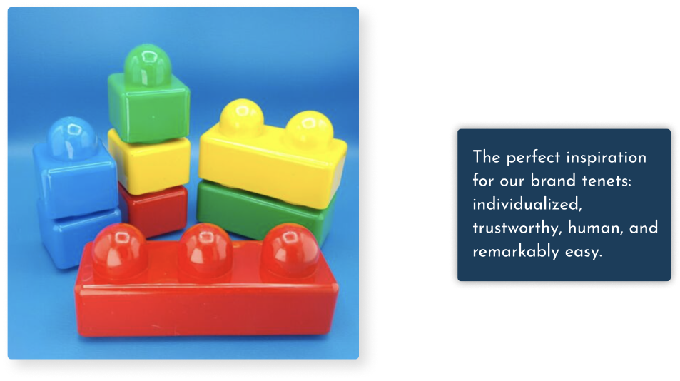
Low Fidelity wireframes inspired by Duplo blocks
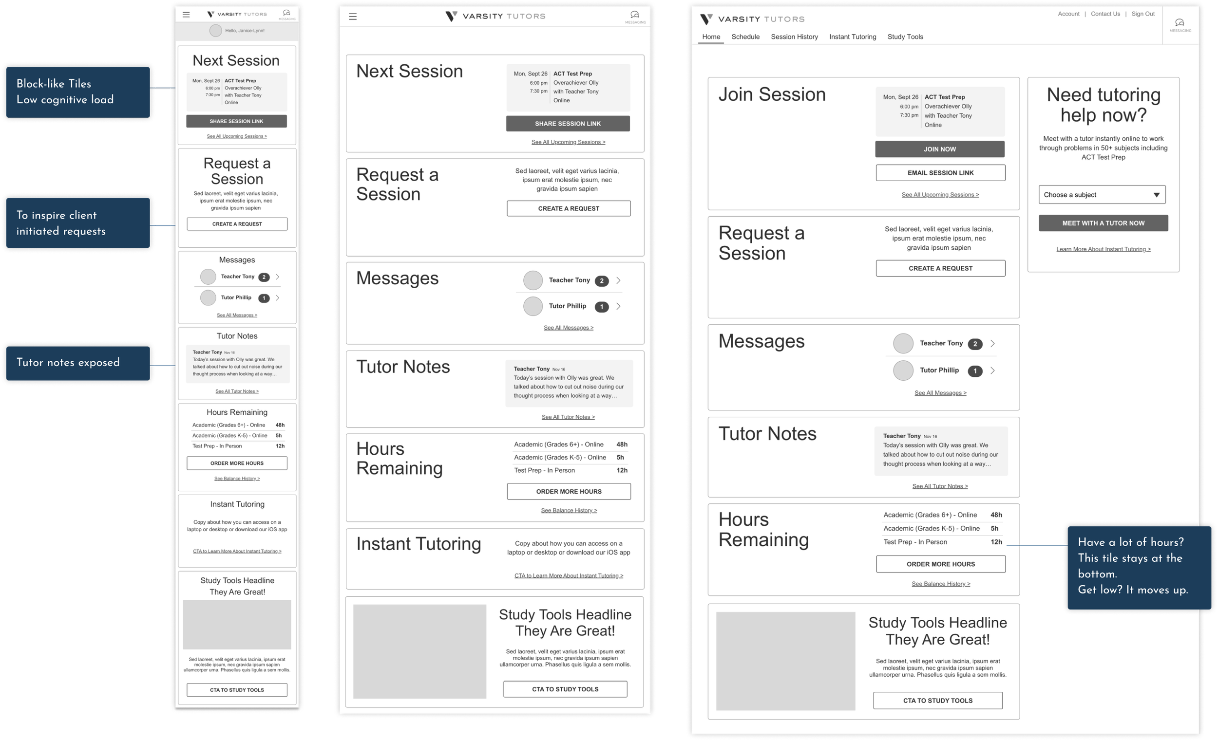
Design exploration
I had two weeks to evolve low fidelity designs for the entire web app. I was able to make time for rapid explorations. Below are some options I explored around how to best have customers select dates and times to request a session with a tutor.
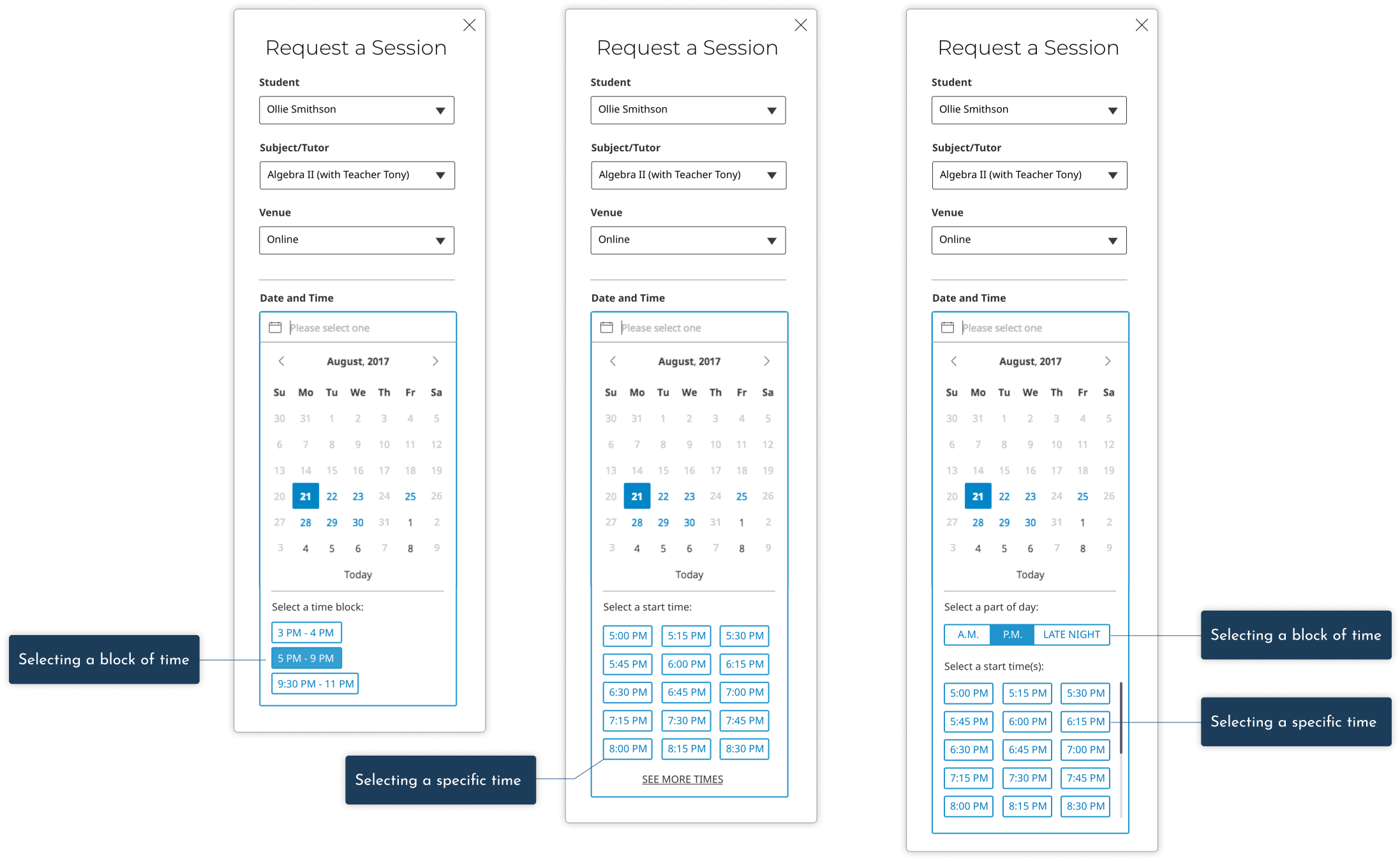
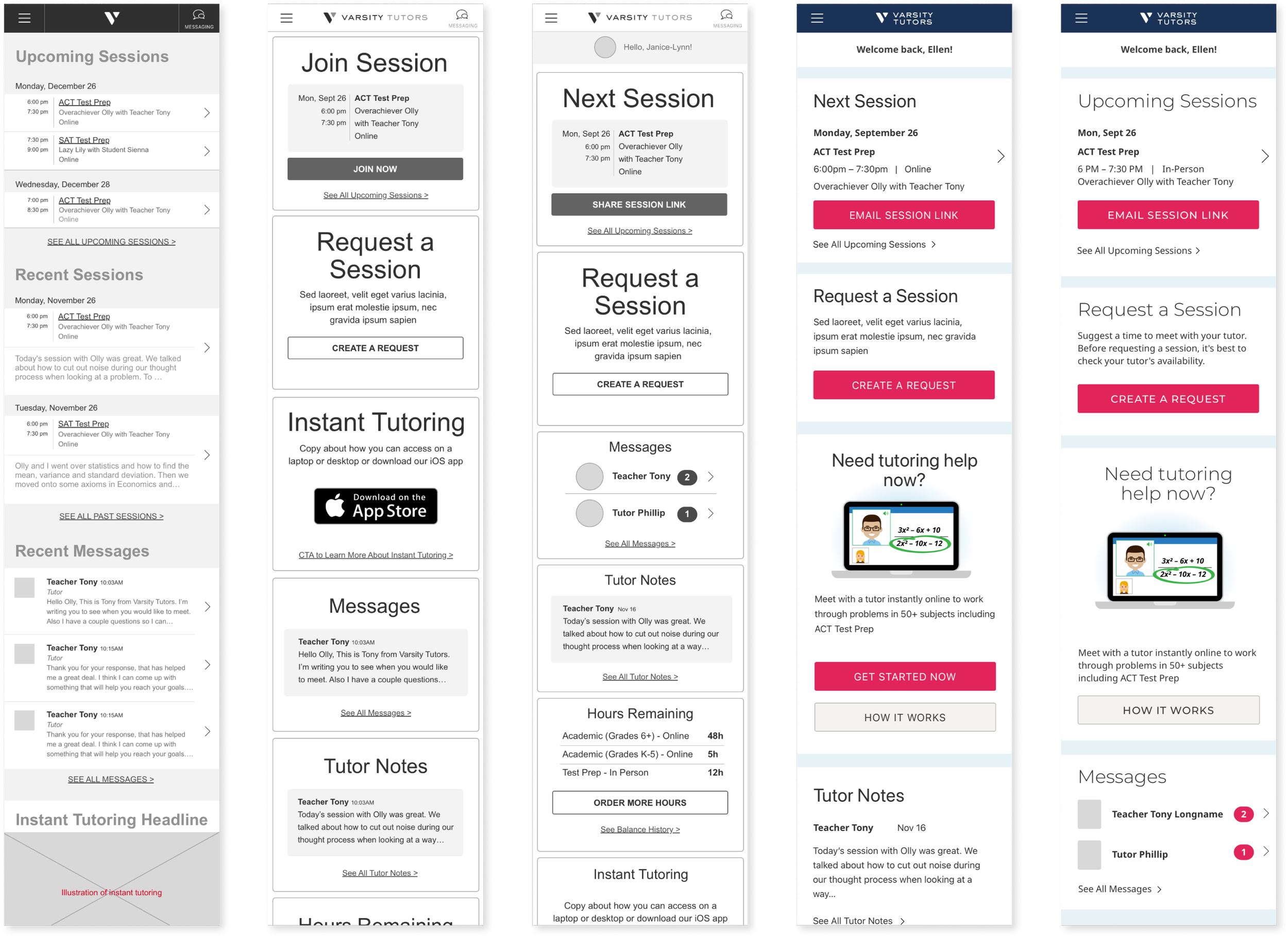
Optimizing for speed with rapid iteration
A look from left to right of the evolution of the home screen. Wireframes for all 12 pages each at 3 breakpoints occurred in 3 weeks bracketing usability testing.
Usability testing for rapid iteration
Approach: I conducted six remote, moderated, one-on-one, one-hour mobile, web usability research sessions. The goal of our research was to gather feedback from current Varsity Tutors parents on the proposed redesign.
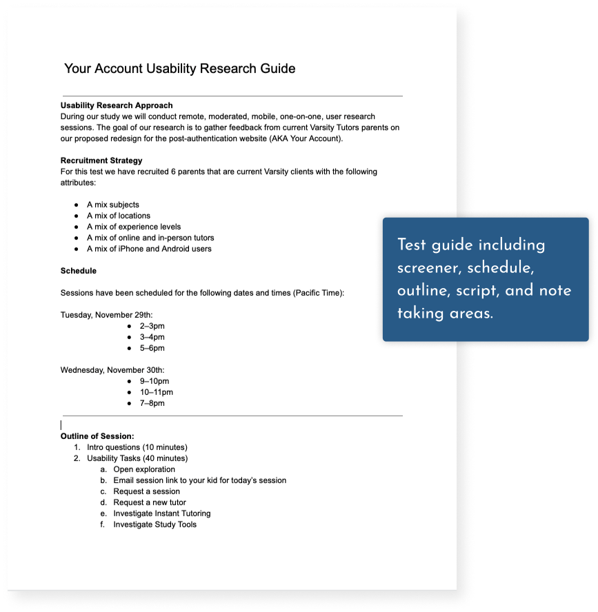
This is the usability test guide I created including the screener, schedule, approach, and conversation guide.
Key Finding
6 of 6 participants were able to complete the following 6 key tasks:
Email your kid, the link to their next online session
Use the site to request a next session
Locate the name and contact info of a former tutor
Change their password
Notice and read the tutor notes
Cancel an upcoming session
Key Finding
Parents were not able to guess what Instant Tutoring is. 3 of our 5 parents who were unfamiliar with Instant Tutoring thought that it was a chat based tool.
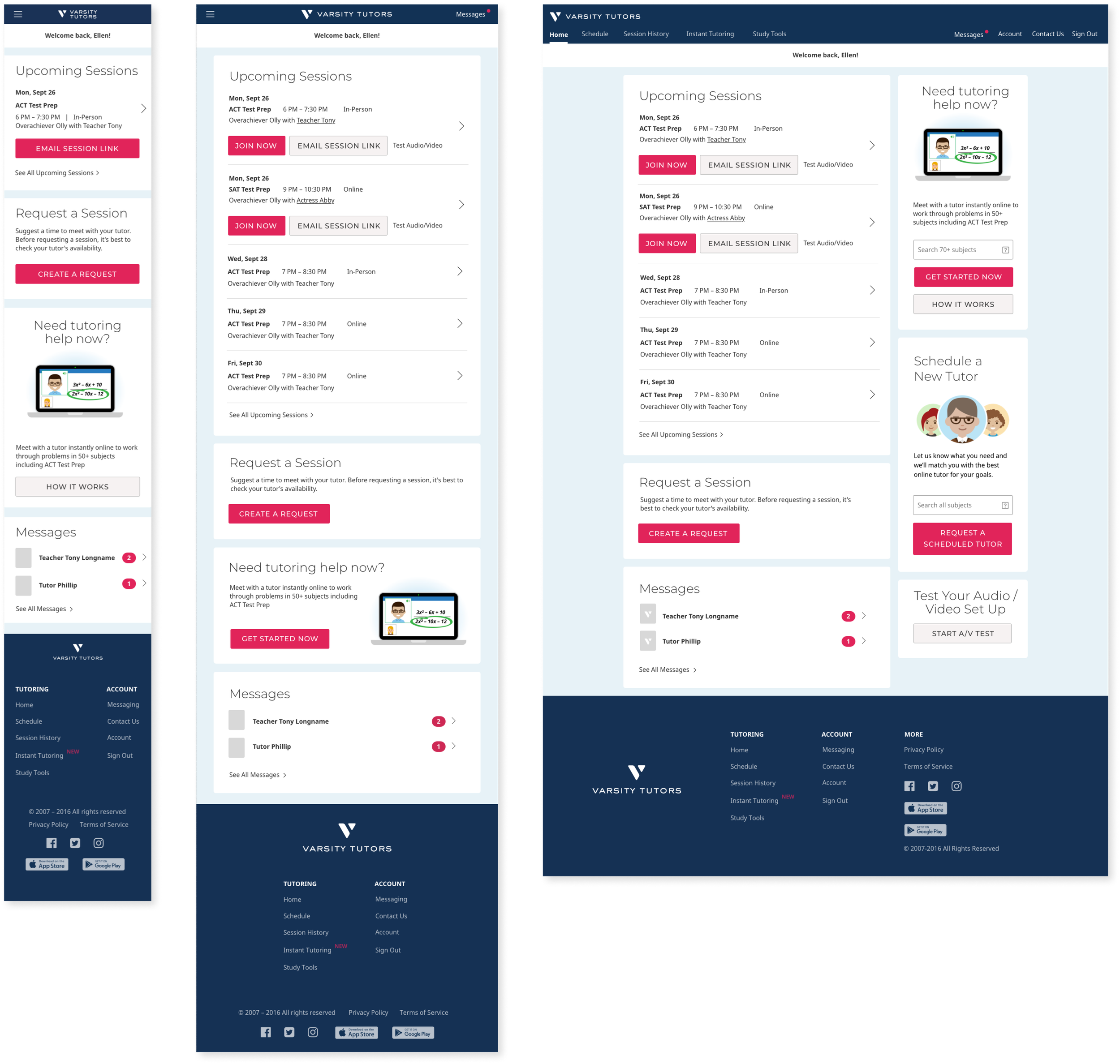
Responsive Design
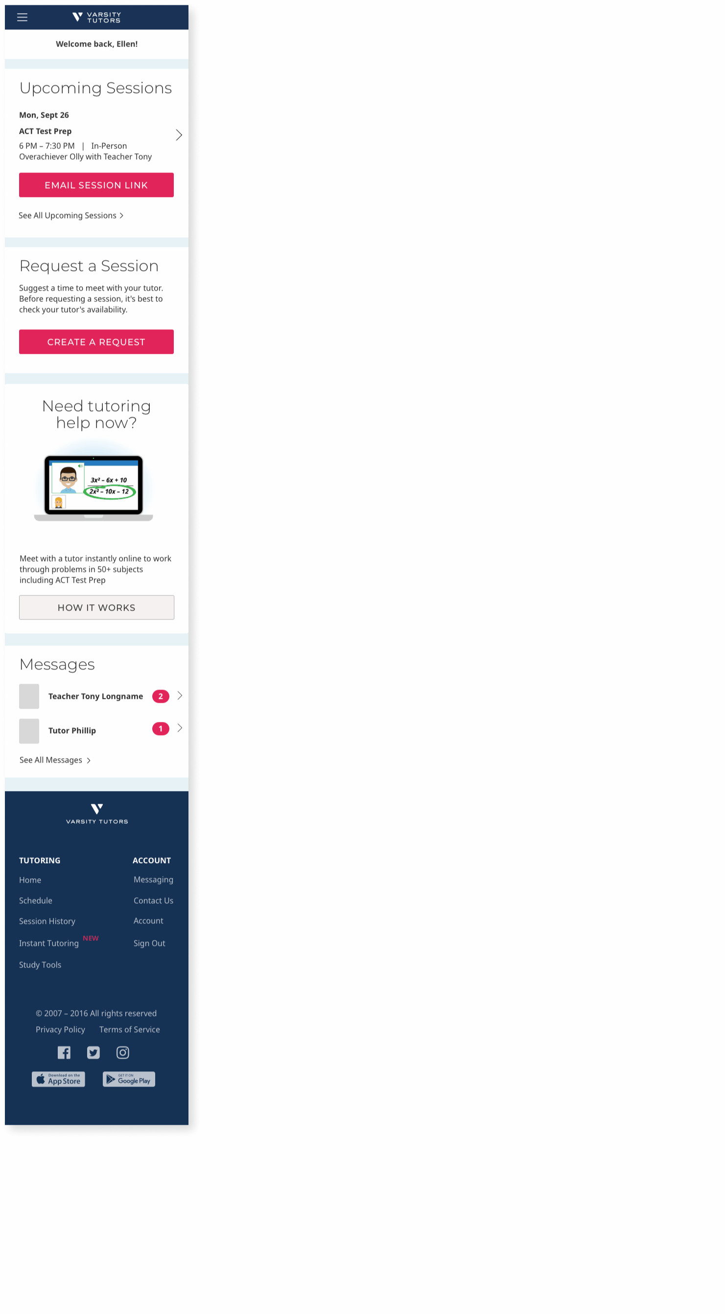
Approach: To accommodate a variety of screen sizes, I designed this 12 page web app in three break points: mobile, tablet, and desktop. This is a look at the home page across those three break points.
Before & After
Home page, desktop, before
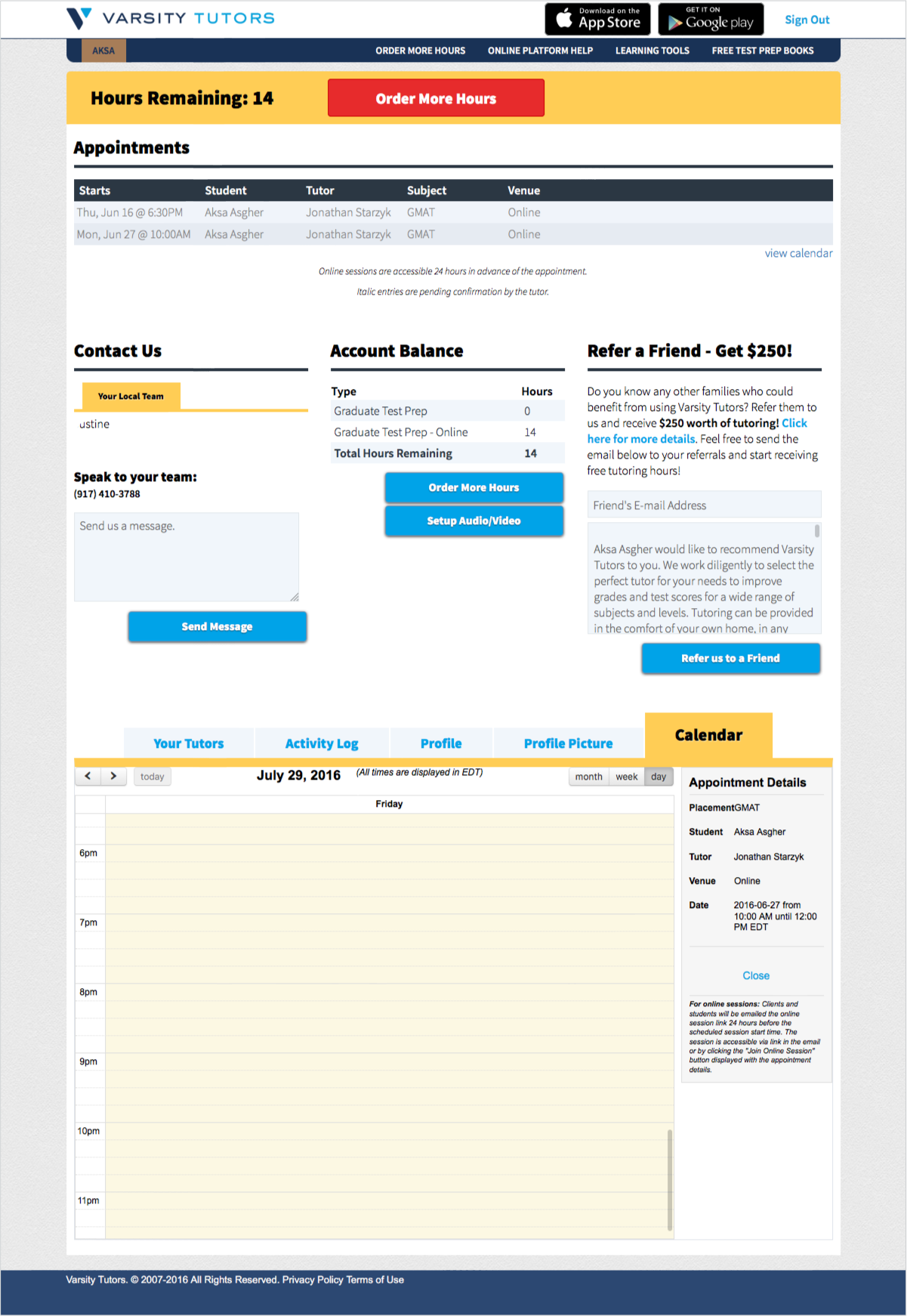
Home page, desktop, after
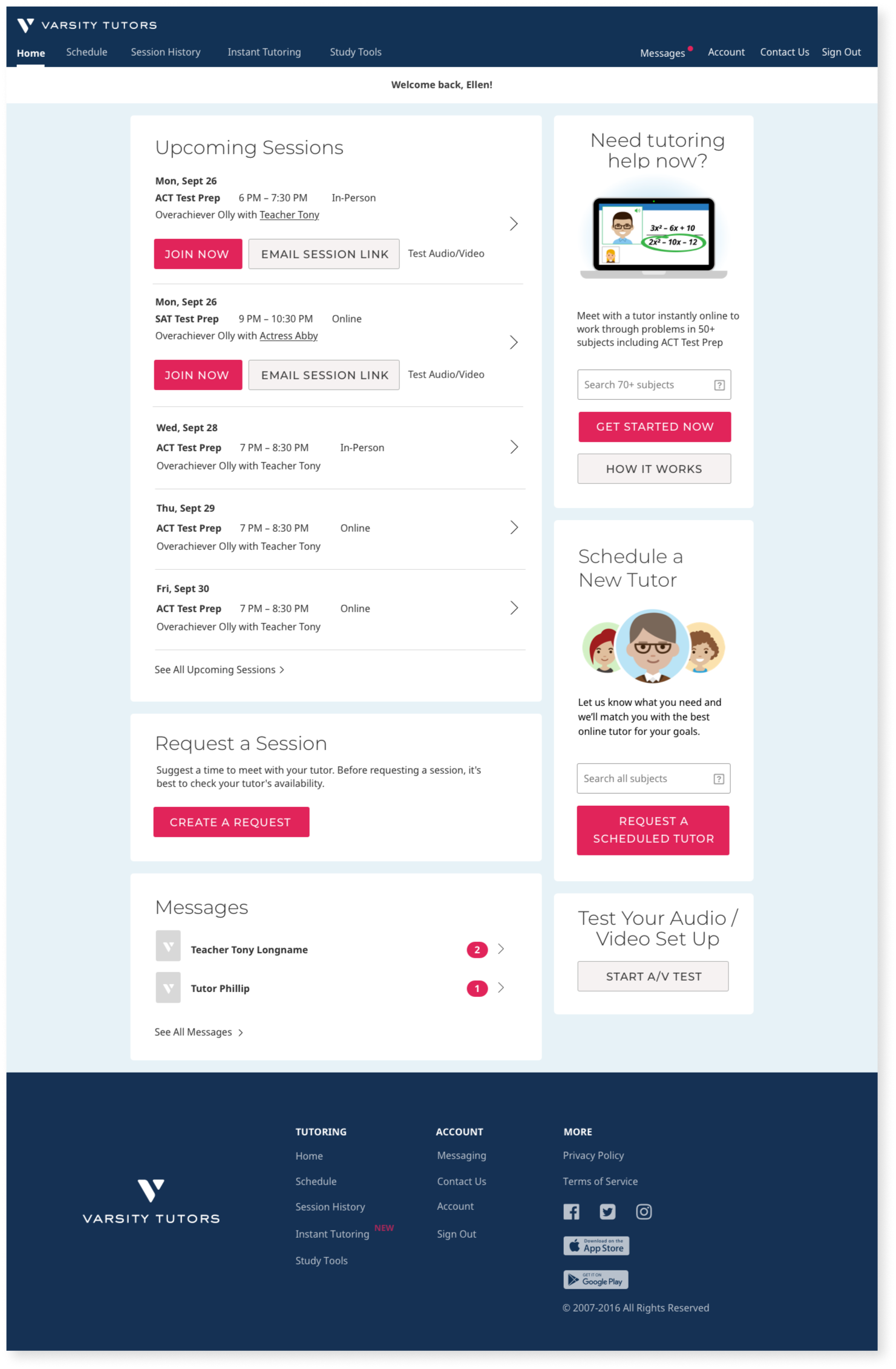
Schedule, desktop, before
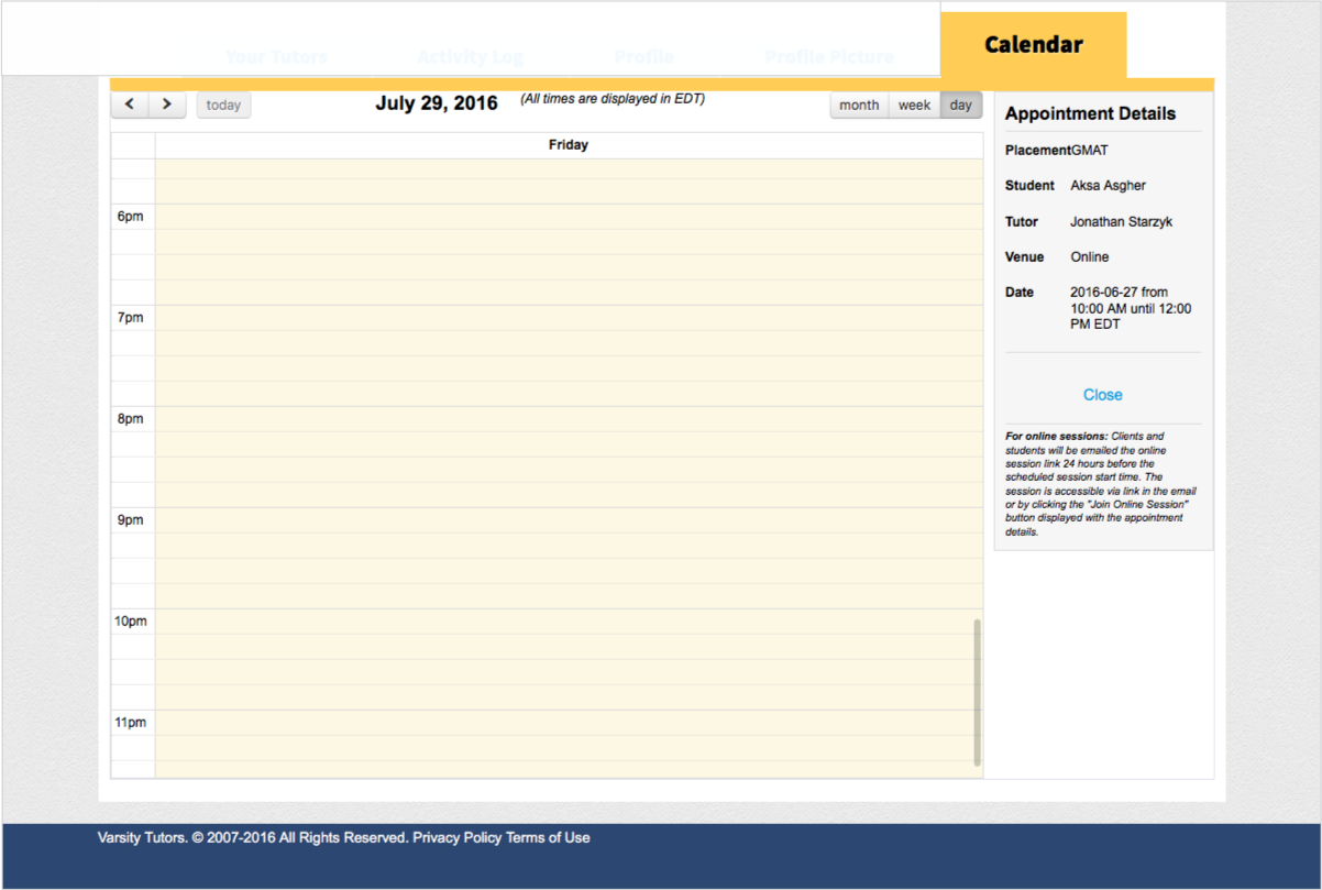
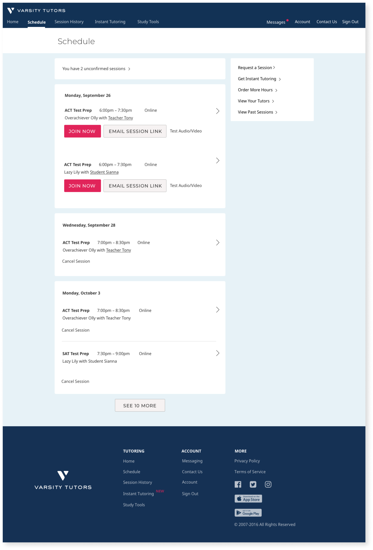
Schedule, desktop, after
Other metrics with positive impact:
Decrease in our refund rate
Increase in the number of customers to 3rd session
Increase in repurchase rate
Great outcomes
This new client account has resulted in a 30% increase in client-initiated sessions!
Feedback from a few of my colleagues involved in this project
"Happiness, humor, and cheerful attitude — Cara has a can-do attitude, and it is infectious. Her work ethic is inspirational."
– Director of Product Design, Varsity Tutors
"Cara puts the customer first and very thoughtful about a simple and efficient design that is informed by engineering... she doesn't overcomplicate, is highly collaborative with product and engineering, and her work reflects the team's efforts. She will hold her ground if the team is headed down a path she knows is not going to be a good pattern. I find her to be an industry expert and highly relevant."
– Senior Product Manager, Varsity Tutors